

Animorphs Graphix #2: “The Visitor” by K.A. Applegate & Michael Grant, Adapted by Chris Grine
Publishing Info: Graphix, October 2021
Where Did I Get this Book: own it!
Book Description: Rachel is still reeling from the news that Earth is secretly under attack by parasitic aliens, the Yeerks. Now she and her friends are the planet’s only defense — kids who, purely by chance, stumbled onto a downed spacecraft and were given the power to morph into any animals they touch.
The team’s best lead is their assistant principal, Mr. Chapman, who is the human host to a high-ranking Yeerk official. It’s not much, but Rachel’s always been a daredevil, and she volunteers to infiltrate Chapman’s home.
Rachel is tough. She’s fearless. But what she finds inside may be more than even she can handle.
I’m baaaaaaack! Yes, yes, it’s been forever. So long in fact that not only is the second Animorphs graphic novel out, but the third was released last fall as well! What’s my excuse?
Anyways, I was very excited to jump back into the world of the Animorphs and check out what these graphic novels have in mind for the long run. I remember really liking the first one, but having some concerns about the longevity of the series. I was also curious to see how this particular story was handled. “The Invasion” has tons of material to work with, not only in the chock-full plot but also with a lot of important character work introducing all of the teens. But “The Visitor” is a much slower, simpler story. In fact, I’d say it’s probably the weakest story in the introductory first five books. I mean, I still love it, because I love Rachel and Applegate is at the helm in these early books and that’s clear in the general quality of a more “filler” story as compared to the same sorts of stories that we see later in the series that don’t land as well. All of that to say, I was curious to see what the graphic novel had in store for us.
Best Change: I really liked the way the Chapmans were portrayed in this version of the story. There’s a really cool couple of pages that are drawn when Rachel first enters the house. We see Mrs. Chapman in the kitchen, staring straight ahead and chopping up vegetables. We then shift to the living room and see Mr. Chapman sitting on the couch staring at a television set that’s turned off. Creepy enough on its own. But then when Rachel comes back in the second go around, we see the exact same thing: Mrs. Chapman in the kitchen, chopping; Mr. Chapman in the living room, staring. It really hits home how absolutely off and cold this house is and what a horrible hell Melissa is living through. Beyond that, I liked how the way Chapman’s face is drawn changes from scene to scene as his power dynamic shifts. When he’s driving Rachel home, he’s shadowy and threatening. But when he’s talking with Visser Three, he’s depicted as small and cowering. And then, lastly, we see the human side of him when the real Chapman gets control briefly to plead his case to Visser Three. It was all very effective, and I think it does a good job of setting up just how witnessing this horrible home situation would influence and motivate Rachel.
Worst Change: I’m not sure I really have a worst change for this book. Other than a few things here and there which I’ll get to later, this is a pretty faithful adaptation of the original book. I’ll go on (and on and onnnn) about my feelings about the art throughout the book, but I think that’s probably not going to be a specific-to-this-book thing so not really a “change” at all. Speaking of art…
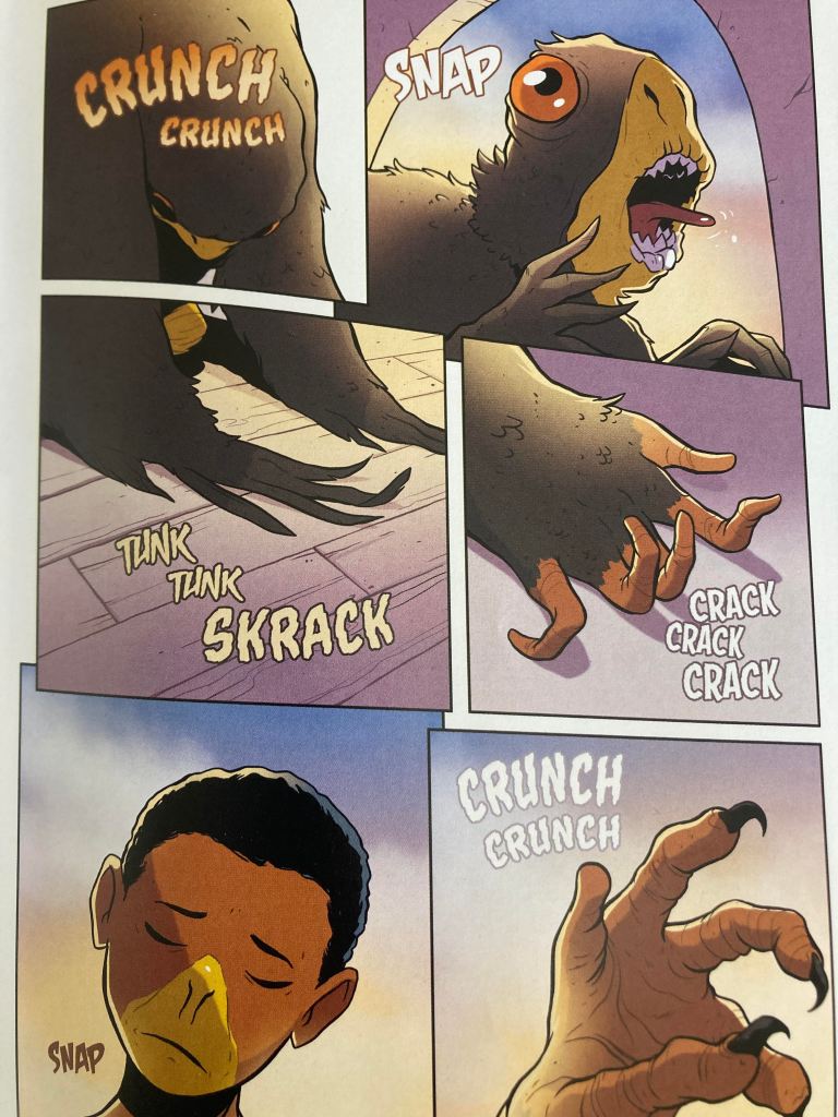
Pretty, Pretty Pictures: I have to say, I’m not coming around on the art style of these books. It’s not a complete loss, but I think there’s a stark difference in quality between the two styles. On one hand, I think the graphics are excellent when done in the more realistic style used for the animals. I also think the larger spreads across two pages and the horror aspects are well done. The descriptions of morphing in the books were always horrific, but when you see it depicted on the page…man, it really captures how truly disgusting this stuff looks. I mean, look at this!

But, I have to say, I’m really not loving the cartoon images of the kids themselves. I wanted to give it more of chance than just the first book, where I didn’t love the fact that Tobias and Rachel looked so similar or the strange choice with the red noses. But this book just confirmed some of my worst fears. If you look at these characters, they all just look exactly the same in the most generic of senses. You wouldn’t even be able to tell who is a boy or who is a girl based on images of just their faces in some of the panels (a picture of Cassie really highlights this at one point where I honestly had to do a double take to remind myself that there wasn’t a random Black boy in this story). This fact is really highlighted early in the story when we first meet Melissa. Here’s the first panel we see her in:

Without the speech bubble, which of these characters is which?? Ultimately, Melissa is given the silly freckles purely to identify and differentiate her later in the book. And that just seems to me to be a failure of the art itself. I mean, I’m still glad these graphic novels are being made so I have a hard time being this critical, but it honestly feels as if the artist either can’t be bothered to draw interesting and unique characters or simply isn’t capable of it while using this cartoonish style. Given the quality of the realistic stuff, I know he’s talented. So it feels like it must be a choice. But it’s the kind of choice that feels as if it’s talking down to its readers: hey, these are just kids and kids are the target audience, why bother making them look like anything other than bobble head cartoons? I don’t know. I’m not a fan.
Our Fearless Leader: Jake is one of the few characters that I think is drawn with a distinct face. His chin is a bit more pointed than the rest, and that difference stood out more and more as I became increasingly frustrated by the other characters. As for the story, there was a nice section in the middle devoted to a conversation between Rachel and Jake about their experiences (nightmares) after morphing frantic-minded prey animals. I like that this much page time was devoted to what can be seen as a pretty small character moment. There’s also an interesting line where Rachel gets a bit defensive saying that Jake is talking down to her because she’s his younger cousin. I can’t remember whether or not we knew that she was the younger of the two from the books? If so, I had forgotten and found it to be an interesting little tidbit here that she’s only a few weeks younger than Jake.
Xena, Warrior Princess: This book is pretty faithful to the original, so there isn’t a lot of new stuff to discuss with regards to Rachel’s experiences in the story. I will say, I really liked seeing Rachel’s mom and sister portrayed on the page. These were nice little moments to get to see one version of what these characters could look like. We get a lot of descriptions of what the main characters looked like in the original text, but we really have basically nothing to go on for any/all side characters. It was also nice to see these moments between Rachel and her mom and Rachel and Jordon to highlight the difference between her own warm, caring family and the cold, prison-like existence that Melissa is suffering through. I really like these sorts of subtle contrasts that the graphic novel can deploy. The book doesn’t come right out and say it, but it’s there all the same.
One thing I didn’t really like was the way the scene was drawn when Rachel is running away from the thugs to morph an elephant in the alley. Granted, again, it’s now been a few years from when I read this book for the original re-read series, but I guess I had it in my mind that Rachel was more annoyed from the very start and never frightened. Whereas here she’s drawn as being legitimately afraid at first, which I think is totally out of character. Rachel wants to take the fight to Visser Three himself, no way is she going to be wincing away from two jerks on the street.
A Hawk’s Life: Not a lot from Tobias. I did like all of the bird action in the very first scene and the way that was all drawn out. Rachel’s outrage about the guys shooting at a bald eagle “a national symbol!!!” is excellent. There were also some lovely images later on of Tobias flying, especially one when he flies away with shrew!Rachel to help give her time to get control of her morph. The way the sky and the silhouettes were drawn was striking.
Peace, Love, and Animals: Given how horrifying the images of the morphing is, I was glad we got to see a panel of Cassie with her raptor wings and Marco’s comment that they all look like freak show contestants while Cassie gets to look like an angel. It was a really nice juxtaposition and a moment that really worked well with the graphic elements. Other than that, Cassie has a pretty subdued go of it. We get some good animal facts from her about the prey mindset and the abilities of cats (there’s a good joke from Marco when Cassie comments that a cat’s eyesight is 8 times better than a humans), but that’s about it.
The Comic Relief: Marco is pretty much the same here as he is in the book. We get more groundwork laid about his home life and why he’s reluctant to fight. His dialogue is by far the funniest and best, per the book’s standard as well. There was one throwaway bit that I thought was odd, however. At one point, a character, I think it was Cassie, compliments Marco on his haircut. From the books, we know this does happen and is commented on but it doesn’t happen until Marco’s second go around as a narrator, all the way through to book number 10. But then the really strange thing is that Marco was depicted with short hair in the first graphic novel, too. Which, honestly, given my comments already about the cartoon style proving challenging to differentiate between male or female characters, I can see the choice to not have him with long hair from the very start. But looking back at the art from the first book, it’s clear that the styling for his hair is slightly different, but if anything, it’s drawn as longer and more shaggy here in the second book, not cut shorter at all. It’s very strange. I don’t think this small of a change really warranted any dialogue at all, but then to write it in as a notable haircut rather than a style change, which is the most that can be said, is strangely incongruent.
E.T./Ax Phone Home: No Ax yet, but boy am I excited to get to him!
Best (?) Body Horror Moment: Beyond what I said above about the disgustingly graphic images of morphing, there was a full page spread devoted to Rachel’s nightmare about being a shrew. Again, this is where the artist’s talents are really on display. I’ve only included half of the spread, but the other side is also covered in maggots swarming in and over an animal skull. I mean, the depiction of the nightmare is going to cause nightmares itself.

Couples Watch!: Sadly, I feel like we got even less from Tobias and Rachel here than we do in the books. We do get the line from Tobias that he doesn’t want anything to happen to her, so there are hints here and there, but for whatever reason, this relationship in particular just felt off. This probably is just due to the nature of the graphic novel format. Since the story relies only on dialogue and images, it’s pretty hard to depict true feelings between a girl and a hawk!boy when you can’t draw them interacting. On the other hand, to highlight this point, we do get this sweet panel coming fairly early in the book for Cassie and Jake:

If Only Visser Three had Mustache to Twirl: Again, since the horror aspects of the art are what work so well, the depictions of Visser Three and the terror he inspires are truly great. Even his Andalite form, which shouldn’t be terrifying in and of itself, is depicted in such a way as to be clearly intimidating. And then the panels showing him morphing the Vanarx and sucking out the Yeerk from a Controller are incredibly creepy and effective. I mean, Visser Three is essentially a cannibal at this point, and that is made pretty clear. And of course, the final battle with Visser Three morphing yet another big bad and chasing after the Animorphs is very well done. More on that below.
Adult Ugly Crying at a Middle Grade Book: Man, the Melissa stuff isn’t any easier when drawn out on the page rather than just described in a book. Plus, now I’m reading these books as a parent myself and boy, rough stuff. Especially the part where she follows Chapman out when he’s carrying cat!Rachel away in the crate. “Oh, I didn’t see you there.” “But daddy…I was crying.” Oooof! Not to sound like a broken record or anything, but again, AGAIN, I think the cartoon style let some of these heart-breaking moments down a bit. The reason this scene hits hard, and the same with the one where Melissa is crying in her bed, is because the writing and dialogue are so strong. The way the characters are drawn, there’s just so little that can be done to express these deep emotions, so it all falls to the writing. I’m having a hard time picturing some of the truly devastating moments that are coming up landing the way they should as shown on the faces of characters with red bubble noses.
What a Terrible Plan, Guys!: I’d say the terrible plan is still the obvious one: where Rachel decides to morph a shrew to lure a tomcat out of a tree. Like Cassie points out, while cats often play with their food, sometimes they just go straight for the kill, too, and there’s really no way of predicting it one way or another. But also, specific to this version of the story, I’ll say that the use of the machinery in the construction site didn’t quite translate here. I can’t remember exactly how it was described in the books, but I felt like there I had a better sense of just how these machines were disrupting Visser Three’s plans. Here, we only see a few small shots of a solitary bulldozer, and it kind of fails to land as to why this would pose any sort of threat or disruption to what the Yeerks are doing.
Favorite Page/Panel:
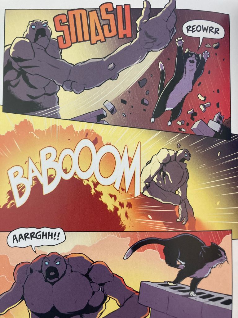
I really liked all of the pages that made up the final conflict between the Animorphs and Visser Three in his alien morph. But this one stood out for the sheer joy of the absurdity of it all. I mean, take that picture out of context. Just look at it. The crazy rock monster. The speech bubbles of the cat growling and alien roaring. The cat’s crazy Superman jump featured prominently in the top right corner. It’s all so whacky and fun, and I think it’s a perfect visual representation of the sheer joy that these books are to read, especially to younger audiences. In no other series of books are you going to get anything remotely like what Animophs has to offer.
Final Thoughts: Overall, I’m still continuing to enjoy reading these graphic novels. I won’t repeat myself about the art, but like I said, too, for all my complaining about that, I’d rather have the graphic novels as they are now than nothing at all. I do hope they continue to make them, but I think there’s room to combine some things going forward. These first six or so books are important enough to have their own adaptations independently, but I think this book specifically also highlights how some future stories could be combined or skipped. Mostly, I just want some adaptation, ANY ADAPTATION, to get to the David trilogy.

Note: I’m not going to rate these books since I can’t be objective at all!
